UI Components
Component library with visual examples from screenshots
UI Components
This document defines the core UI components used throughout the HRMS application, with visual references from the prototype screenshots.
Design System Overview
All components follow the HRMSElegance design system:
Color System
Core Palette
| Element | Hex | HSL | Tailwind |
|---|---|---|---|
| Primary | #008CF0 | 205 100% 47% | blue-500 |
| Secondary | #383B53 | 233 19% 27% | slate-700 |
| Background | #F2F2F7 | 240 14% 96% | gray-100 |
| Card | #FFFFFF | - | white |
| Text Primary | #000000 | - | gray-900 |
| Text Muted | #8E8E93 | 240 4% 46% | gray-500 |
| Success | #52C41A | 96 75% 44% | green-500 |
| Warning | #FAAD14 | 40 96% 53% | amber-500 |
| Error | #FF4D4F | 359 100% 65% | red-500 |
Gradient Presets
const gradients = {
  blue: 'from-blue-500 to-blue-600',      // Employees, Vacation
  orange: 'from-amber-400 to-orange-500', // On Leave, Sick Leave
  purple: 'from-violet-500 to-purple-600', // Pending, Personal
  green: 'from-emerald-400 to-green-500', // Open Positions
  ai: 'from-violet-500 via-purple-500 to-fuchsia-500', // AI Button
};
Stats Cards
Visual Reference: Dashboard screenshot - top row of colorful cards
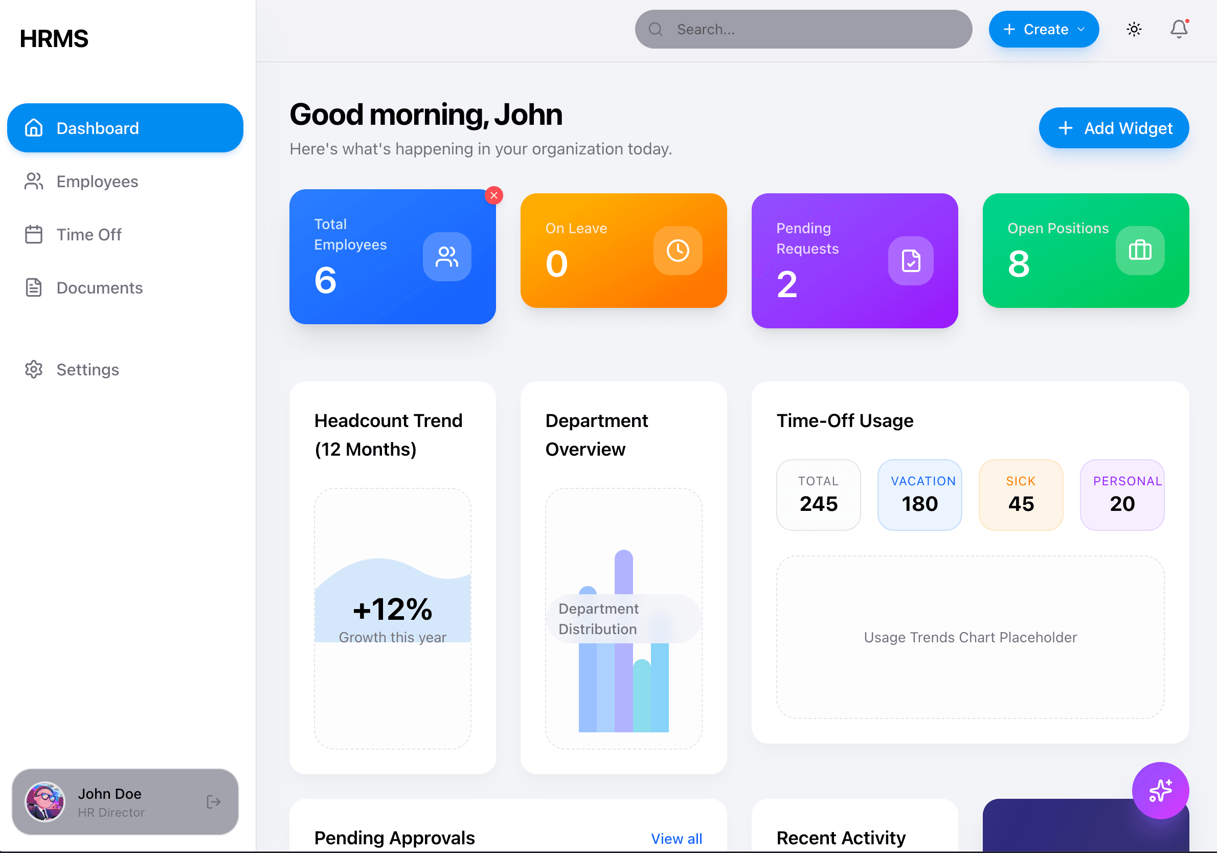
Stats cards use gradient backgrounds with white text. They appear on the Dashboard and show key metrics.
Implementation
// Stats Card Component
<div className="
  bg-gradient-to-br from-blue-500 to-blue-600
  rounded-2xl p-6 text-white shadow-lg
  transition-all hover:shadow-xl hover:-translate-y-1 duration-300
">
  <div className="flex items-center justify-between">
    <div>
      <p className="text-white/80 text-sm font-medium">Total Employees</p>
      <p className="text-4xl font-semibold tracking-tight">6</p>
    </div>
    <div className="w-12 h-12 bg-white/20 rounded-2xl flex items-center justify-center backdrop-blur-sm">
      <Users className="w-6 h-6 text-white" />
    </div>
  </div>
</div>
Variants
| Variant | Gradient | Use Case |
|---|---|---|
| Blue | from-blue-500 to-blue-600 | Total Employees |
| Orange | from-amber-400 to-orange-500 | On Leave |
| Purple | from-violet-500 to-purple-600 | Pending Requests |
| Green | from-emerald-400 to-green-500 | Open Positions |
Balance Cards
Visual Reference: Time Off screenshot - top balance display
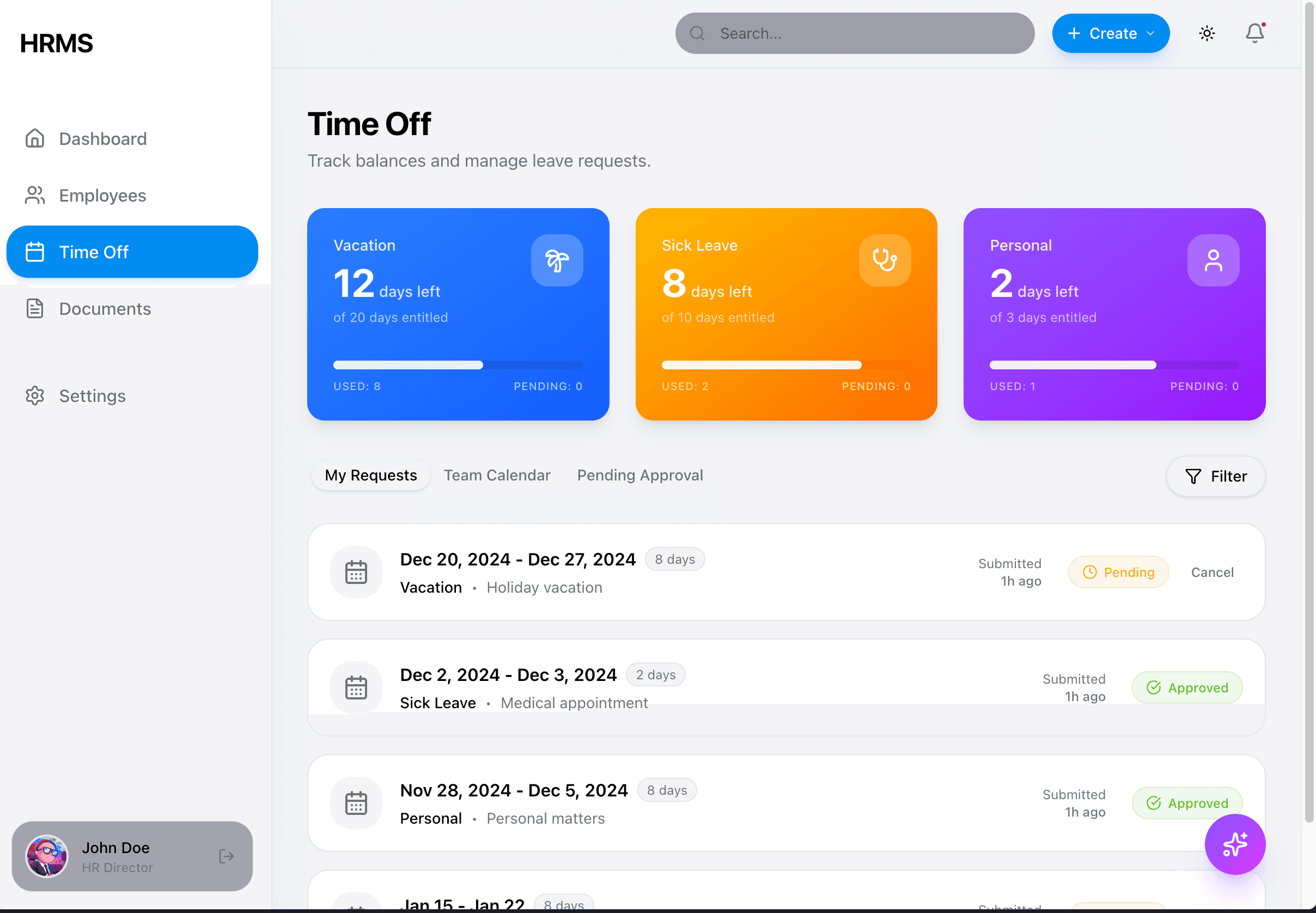
Balance cards show leave entitlements with progress indicators.
Implementation
// Balance Card Component
<div className="
  bg-gradient-to-br from-blue-500 to-blue-600
  rounded-2xl p-6 text-white shadow-lg
">
  <div className="flex items-center justify-between mb-2">
    <span className="text-sm font-medium text-white/80">Vacation</span>
    <div className="w-10 h-10 bg-white/20 rounded-xl flex items-center justify-center">
      <Palmtree className="w-5 h-5" />
    </div>
  </div>
  <p className="text-3xl font-bold">12 <span className="text-lg font-normal">days left</span></p>
  <p className="text-sm text-white/70 mt-1">of 20 days entitled</p>

  {/* Progress bar */}
  <div className="mt-4 h-1.5 bg-white/20 rounded-full">
    <div className="h-full bg-white rounded-full" style={{ width: '60%' }} />
  </div>

  <div className="flex justify-between mt-2 text-xs text-white/70">
    <span>USED: 8</span>
    <span>PENDING: 0</span>
  </div>
</div>
Content Cards
Visual Reference: All screenshots - white content areas
Content cards use white backgrounds with soft shadows, NO borders.
Implementation
// Content Card
<div className="
  bg-card text-card-foreground
  rounded-2xl shadow-lg shadow-gray-200/50
  dark:shadow-black/40
  p-6 border-none
">
  <h3 className="text-lg font-semibold">Card Title</h3>
  <p className="text-muted-foreground mt-1">Card description</p>
  {/* Content */}
</div>
DO NOT Use
- ❌
borderclasses on cards (use shadows instead) - ❌
rounded-lg(userounded-2xl) - ❌
shadow-sm(useshadow-lg shadow-gray-200/50) - ❌
p-4on cards (usep-6)
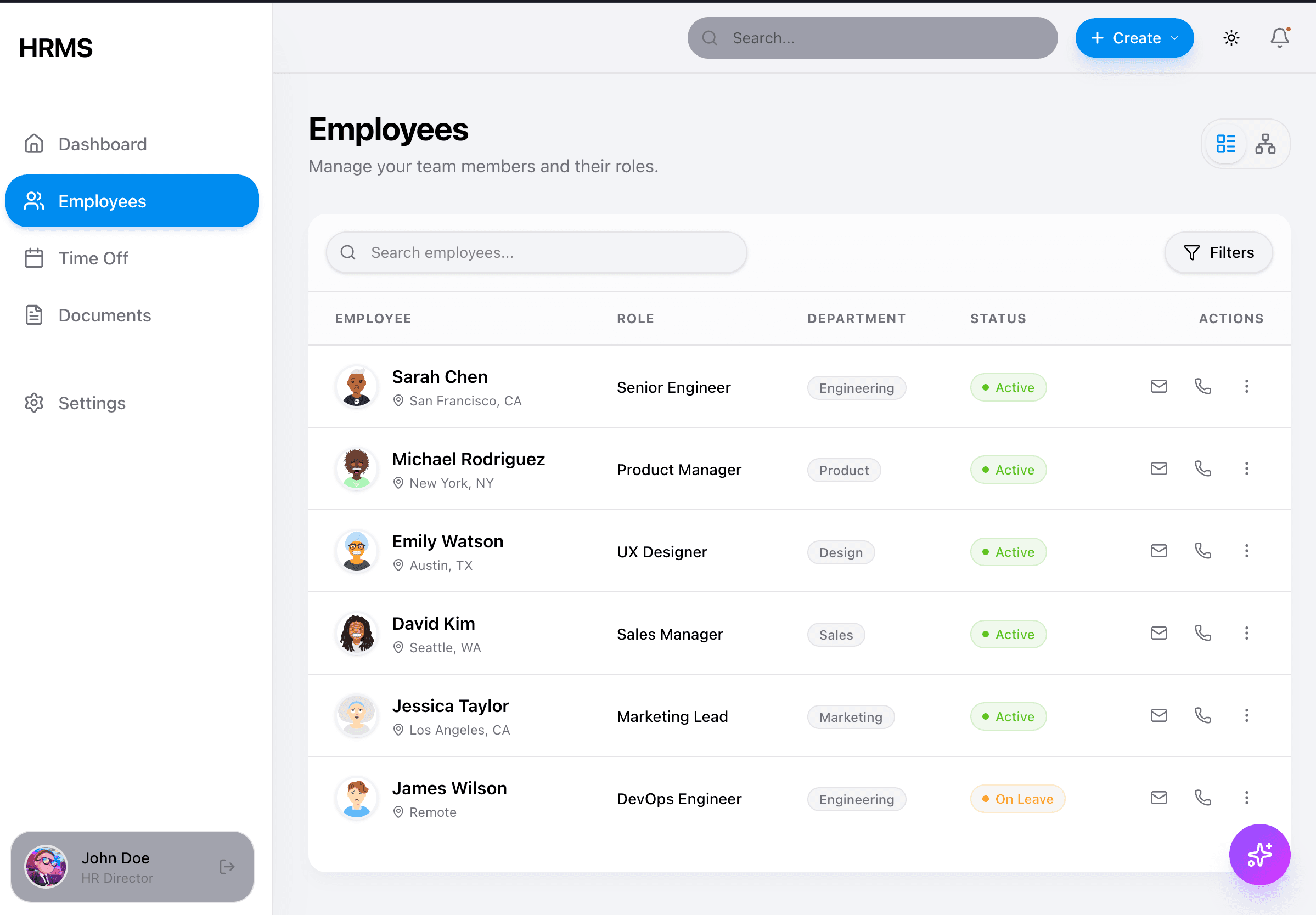
Data Tables
Visual Reference: Employees list screenshot
Implementation
// Data Table
<div className="bg-card rounded-2xl shadow-lg shadow-gray-200/50 overflow-hidden">
  <table className="w-full">
    <thead className="bg-gray-50/50">
      <tr>
        <th className="text-left px-6 py-4 text-xs font-medium text-gray-500 uppercase tracking-wider">
          Employee
        </th>
        {/* More headers */}
      </tr>
    </thead>
    <tbody className="divide-y divide-gray-100">
      <tr className="hover:bg-gray-50/50 transition-colors">
        <td className="px-6 py-4">
          <div className="flex items-center gap-3">
            <Avatar />
            <div>
              <p className="font-medium text-gray-900">Sarah Chen</p>
              <p className="text-sm text-gray-500">San Francisco, CA</p>
            </div>
          </div>
        </td>
        {/* More cells */}
      </tr>
    </tbody>
  </table>
</div>
Status Badges
Visual Reference: Employees list - Status column
Implementation
// Status Badge
const statusStyles = {
  active: 'bg-emerald-100 text-emerald-700',
  on_leave: 'bg-amber-100 text-amber-700',
  pending: 'bg-orange-100 text-orange-600',
  approved: 'bg-green-100 text-green-700',
};

<span className={cn(
  "inline-flex items-center gap-1 text-xs font-medium px-2.5 py-1 rounded-full",
  statusStyles[status]
)}>
  <span className="w-1.5 h-1.5 rounded-full bg-current" />
  {label}
</span>| Status | Background | Text | Dot |
|---|---|---|---|
| Active | bg-emerald-100 | text-emerald-700 | Green |
| On Leave | bg-amber-100 | text-amber-700 | Orange |
| Pending | bg-orange-100 | text-orange-600 | Orange |
| Approved | bg-green-100 | text-green-700 | Green |
Department/Tag Badges
Visual Reference: Employees list - Department column
// Tag Badge (neutral)
<span className="text-xs px-2.5 py-1 bg-gray-100 text-gray-600 rounded-full">
  Engineering
</span>

// Colored attribute tags (from employee profile)
<span className="text-xs px-2.5 py-1 bg-blue-100 text-blue-700 rounded-full border border-blue-200">
  REMOTE
</span>
<span className="text-xs px-2.5 py-1 bg-cyan-100 text-cyan-700 rounded-full">
  Remote
</span>
<span className="text-xs px-2.5 py-1 bg-amber-100 text-amber-700 rounded-full">
  Senior
</span>
<span className="text-xs px-2.5 py-1 bg-green-100 text-green-700 rounded-full">
  Full-time
</span>
Buttons
Visual Reference: All screenshots - various buttons
Primary Button
<button className="
  bg-primary text-white font-medium
  px-6 py-2.5 rounded-full
  shadow-lg shadow-primary/25
  hover:shadow-primary/35 hover:scale-[1.02]
  active:scale-95
  transition-all
">
  Save Changes
</button>
Secondary/Ghost Button
<button className="
  bg-gray-100 text-gray-700 font-medium
  px-6 py-2.5 rounded-full
  hover:bg-gray-200
  transition-all
">
  Cancel
</button>
Icon Button
<button className="
  p-2 rounded-lg
  hover:bg-gray-100
  transition-colors
">
  <MoreHorizontal className="w-5 h-5 text-gray-500" />
</button>
AI Floating Button
Visual Reference: All screenshots - bottom right corner
Implementation
<motion.button
  className="
    fixed z-50 bottom-6 right-6 md:bottom-8 md:right-8
    w-14 h-14 rounded-full
    bg-gradient-to-br from-violet-500 via-purple-500 to-fuchsia-500
    text-white
    shadow-xl shadow-violet-500/30
    hover:shadow-2xl hover:shadow-violet-500/40
    flex items-center justify-center
  "
  whileHover={{ scale: 1.05 }}
  whileTap={{ scale: 0.95 }}
>
  <Sparkles className="w-6 h-6" />
</motion.button>
Key Properties:
- Gradient:
from-violet-500 via-purple-500 to-fuchsia-500 - Shadow:
shadow-xl shadow-violet-500/30 - Hover shadow:
shadow-2xl shadow-violet-500/40 - Scale animation on hover/tap
Navigation Items
Visual Reference: Sidebar mobile screenshot
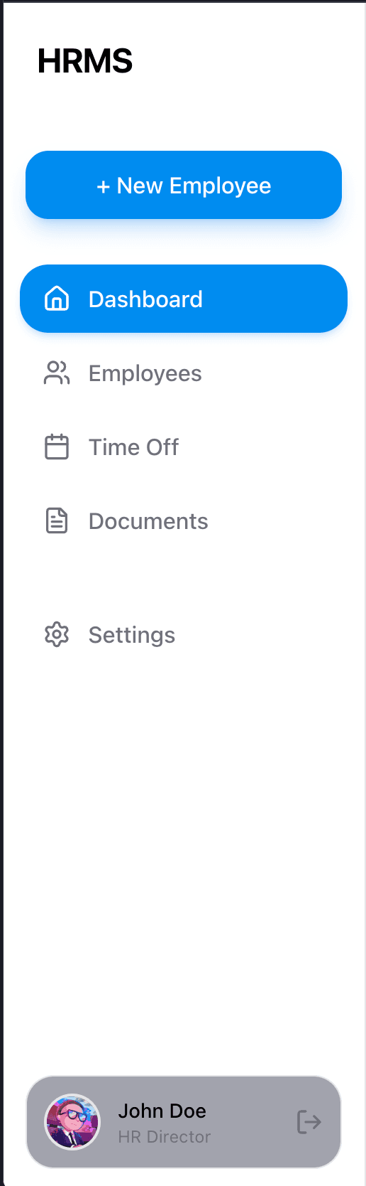
Sidebar Item
// Inactive
<a className="
  flex items-center gap-3 px-3 py-2.5 rounded-xl
  text-muted-foreground
  hover:bg-gray-100 hover:text-foreground
  transition-colors
">
  <Home className="w-5 h-5" />
  <span>Dashboard</span>
</a>

// Active
<a className="
  flex items-center gap-3 px-3 py-2.5 rounded-xl
  bg-primary text-white
  shadow-md shadow-primary/20
">
  <Home className="w-5 h-5" />
  <span>Dashboard</span>
</a>
Form Inputs
Visual Reference: Settings screenshots
Text Input
<div className="space-y-2">
  <label className="text-sm font-medium text-gray-700">
    Organization Name
  </label>
  <input
    type="text"
    className="
      w-full px-4 py-2.5
      bg-gray-100 rounded-xl
      border-none
      focus:outline-none focus:ring-2 focus:ring-primary/30
      text-gray-900 placeholder:text-gray-500
    "
    placeholder="Enter organization name"
  />
</div>
Select/Dropdown
<div className="space-y-2">
  <label className="text-sm font-medium text-gray-700">
    Timezone
  </label>
  <select className="
    w-full px-4 py-2.5
    bg-gray-100 rounded-xl
    border-none
    focus:outline-none focus:ring-2 focus:ring-primary/30
    text-gray-900
    appearance-none
  ">
    <option>America/New_York (EST)</option>
  </select>
</div>
Settings Tab Navigation
Visual Reference: Settings desktop screenshots
Desktop (Vertical Sidebar)
<nav className="w-56 space-y-1">
  {/* Active */}
  <a className="
    flex items-center gap-3 px-4 py-2.5 rounded-xl
    bg-primary text-white
  ">
    <Building className="w-5 h-5" />
    <span>Organization</span>
  </a>

  {/* Inactive */}
  <a className="
    flex items-center gap-3 px-4 py-2.5 rounded-xl
    text-gray-600 hover:bg-gray-100
    transition-colors
  ">
    <User className="w-5 h-5" />
    <span>My Preferences</span>
  </a>
</nav>
Mobile (Accordion)
<div className="bg-card rounded-2xl shadow-lg p-2 space-y-1">
  {/* Active item */}
  <button className="
    w-full flex items-center gap-3 px-4 py-3 rounded-xl
    bg-primary text-white
  ">
    <User className="w-5 h-5" />
    <span>My Preferences</span>
  </button>

  {/* Inactive item */}
  <button className="
    w-full flex items-center gap-3 px-4 py-3 rounded-xl
    bg-gray-100 text-gray-700
  ">
    <Building className="w-5 h-5" />
    <span>Organization</span>
  </button>
</div>
Quick Reference Table
| Component | Key Classes | Screenshot Reference |
|---|---|---|
| Stats Card | bg-gradient-to-br rounded-2xl p-6 shadow-lg | dashboard-desktop.png |
| Content Card | bg-card rounded-2xl shadow-lg shadow-gray-200/50 p-6 | All pages |
| Primary Button | bg-primary rounded-full px-6 py-2.5 shadow-lg | Settings pages |
| Status Badge | text-xs px-2.5 py-1 rounded-full | employees-list-desktop.png |
| AI Button | bg-gradient-to-br from-violet-500 via-purple-500 to-fuchsia-500 rounded-full shadow-xl | All pages |
| Sidebar Item Active | bg-primary text-white rounded-xl shadow-md | sidebar-mobile.png |
| Input | bg-gray-100 rounded-xl px-4 py-2.5 | Settings pages |