UI Screenshots
Visual reference for the HRMS application interface
UI Screenshots
This chapter provides visual documentation of the HRMS application interface. These screenshots serve as the definitive design reference for AI coding agents and developers building the frontend.
Design Philosophy
The HRMS UI follows an Apple-iOS + Colorful Widgets hybrid design:
| Element | Style | Visual Reference |
|---|---|---|
| Stats Cards | Colorful gradients | Blue, Orange, Purple, Green |
| Content Cards | White + soft shadows | rounded-2xl shadow-lg |
| Sidebar | Light theme-aware | White background, blue active state |
| AI Button | Violet gradient glow | Fixed bottom-right position |
| Buttons | Pill-shaped | rounded-full with scale effects |
Dashboard
The main dashboard displays key HR metrics with colorful gradient stat cards and widget sections.
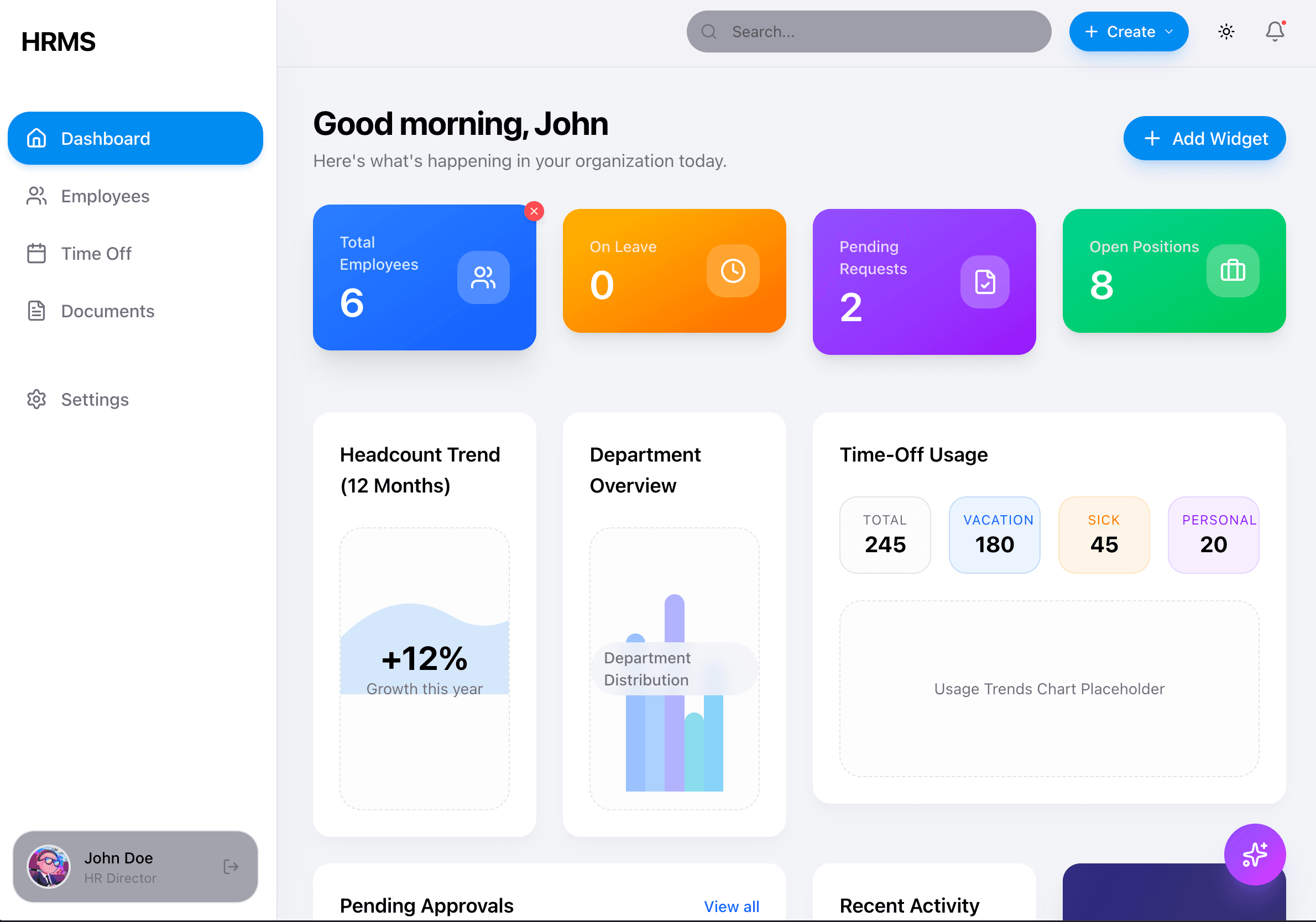
Key Elements:
- Greeting with user name
- 4 gradient stats cards (Total Employees, On Leave, Pending Requests, Open Positions)
- Headcount Trend chart
- Department Overview chart
- Time-Off Usage summary
- Pending Approvals list
- Recent Activity feed
- "+ Add Widget" button
Implementation: Phase 08 - Dashboard
Employees
Employee List
The employees page shows all team members in a searchable, filterable table.
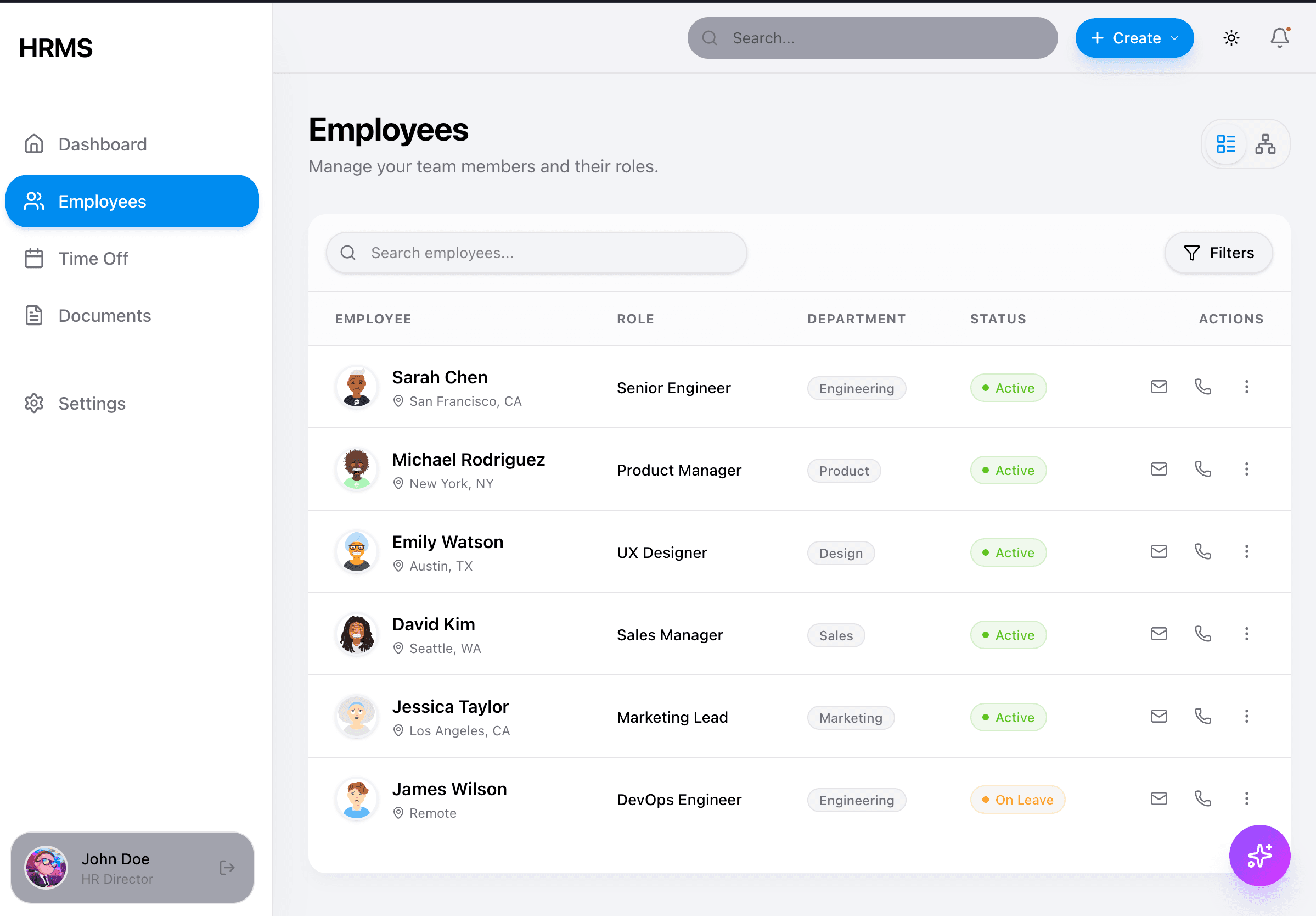
Key Elements:
- Page title with description
- List/Org-chart view toggle (top right icons)
- Search input with filter button
- Table columns: Employee (avatar, name, location), Role, Department (badge), Status (colored badge), Actions
- Status badges: Active (green), On Leave (orange)
- Action icons: email, phone, more menu
Implementation: Phase 02 - Employee Entity
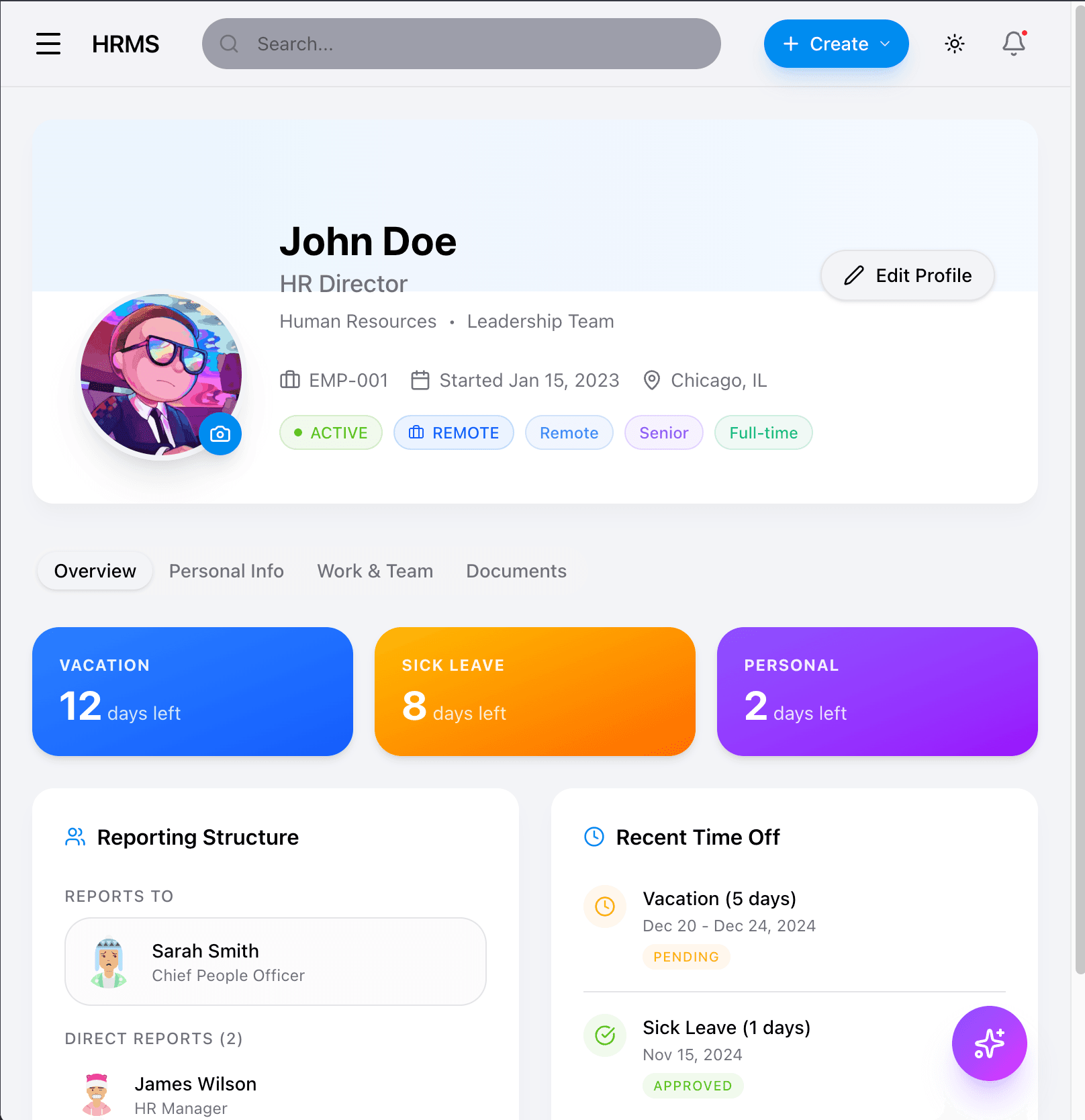
Employee Profile - Desktop
The employee profile page shows comprehensive employee information with tabs.
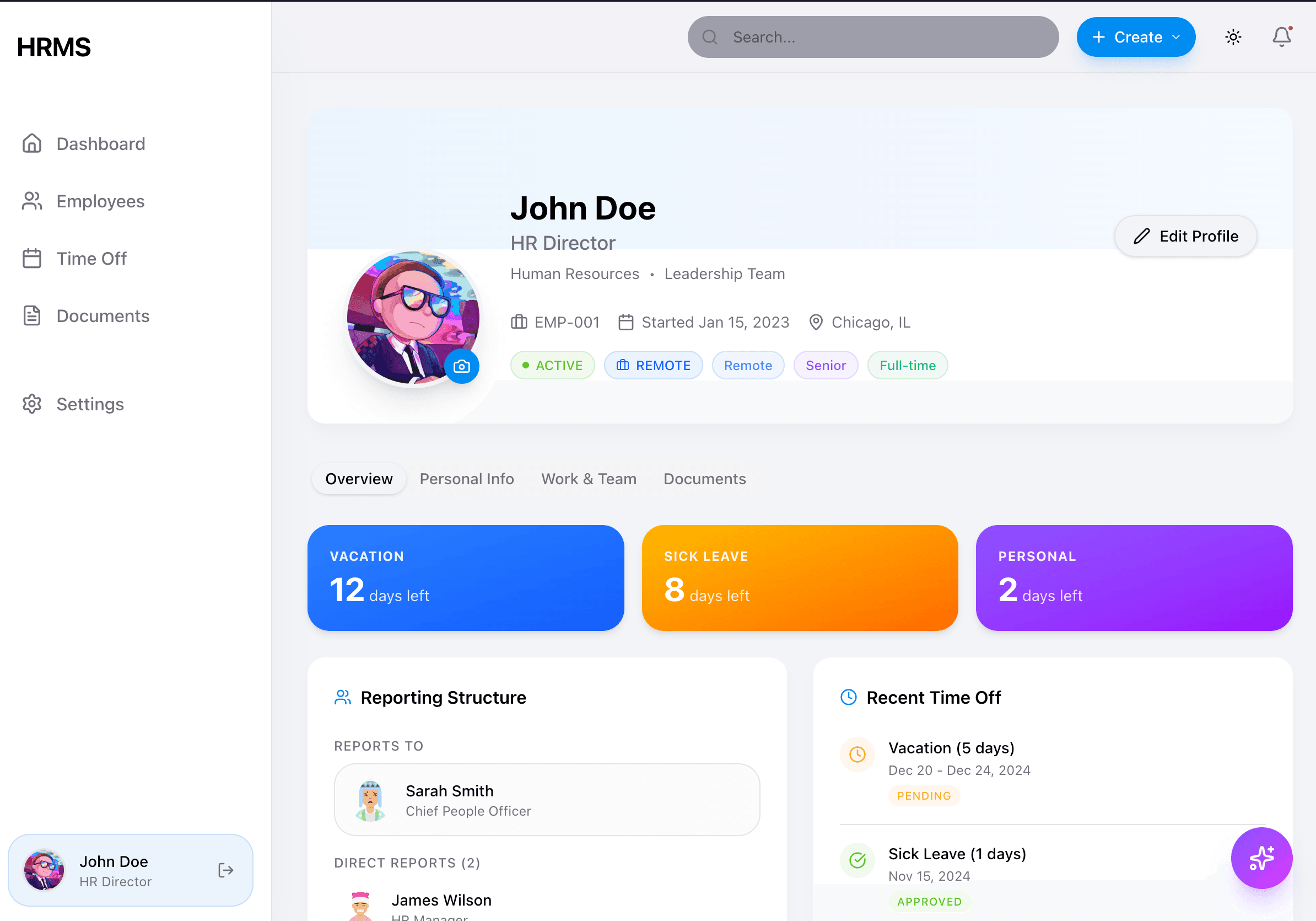
Key Elements:
- Header with cover gradient and avatar (with camera icon for upload)
- Name, title, department, team
- Employee ID, start date, location
- Status and attribute tags (Active, Remote, Senior, Full-time)
- Edit Profile button
- Tab navigation: Overview, Personal Info, Work & Team, Documents
- Time-off balance cards (Vacation, Sick Leave, Personal)
- Reporting Structure card (Reports To, Direct Reports)
- Recent Time Off list
Employee Profile - Mobile

Mobile Adaptations:
- Stacked layout
- Accordion for section navigation
- Full-width balance cards
- Hamburger menu in header
Implementation: Phase 02 - Employee Entity
Time Off
The time-off page manages leave requests and displays balance information.
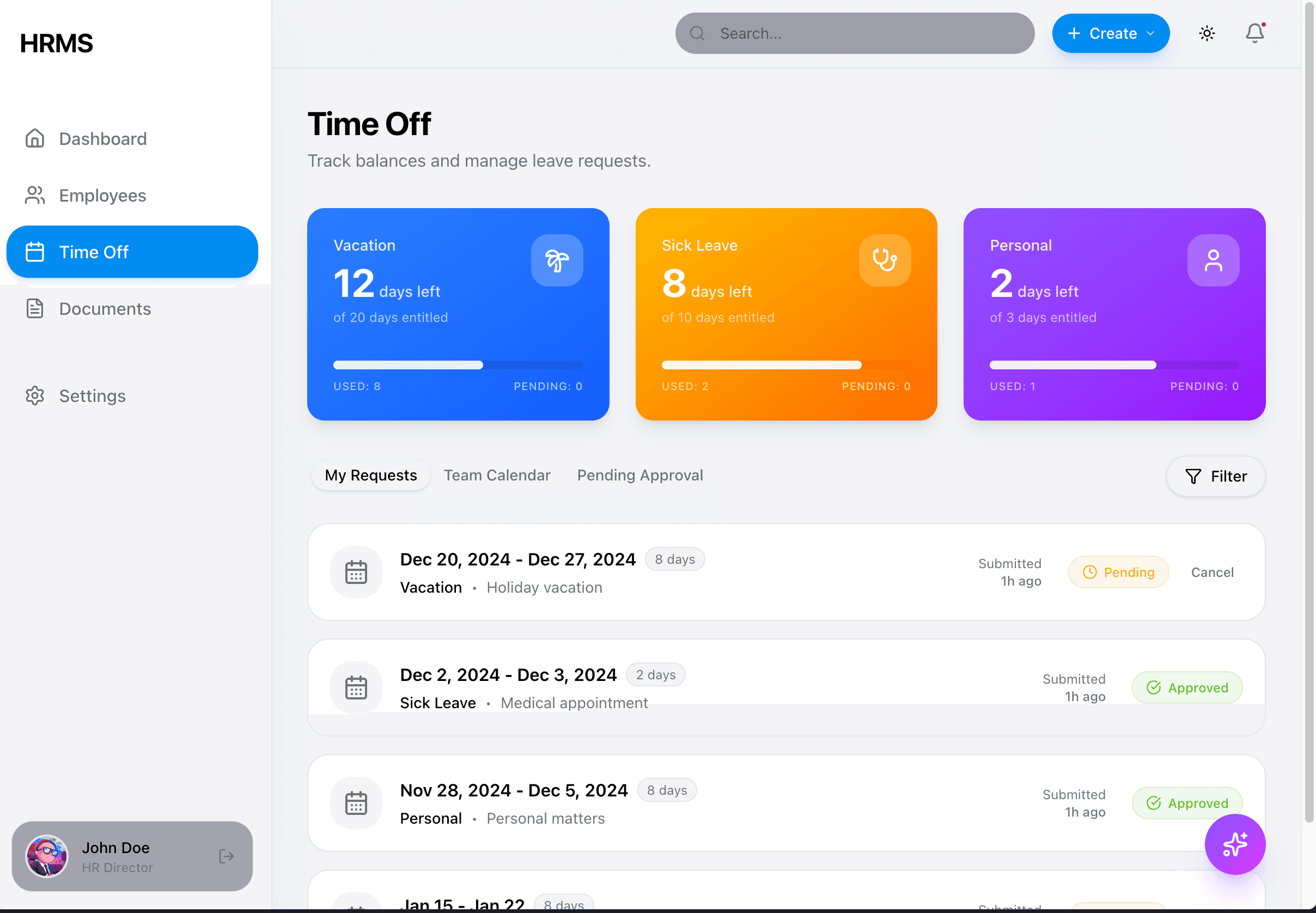
Key Elements:
- 3 balance cards with gradients (Vacation/blue, Sick Leave/orange, Personal/purple)
- Each card shows: days left, total entitled, progress bar, used/pending counts
- Tab navigation: My Requests, Team Calendar, Pending Approval
- Filter button
- Request list with: date range, duration badge, type, reason, status badge, cancel action
- Status badges: Pending (orange), Approved (green)
Implementation: Phase 05 - Time Off
Documents
The documents page organizes HR documents by category.

Key Elements:
- Search bar with filter button
- Category sections with icons (Contract, Policy)
- Document count per category
- Document cards showing: name, date, category tag
- Copy/download icon on each document
Implementation: Phase 06 - Document Management
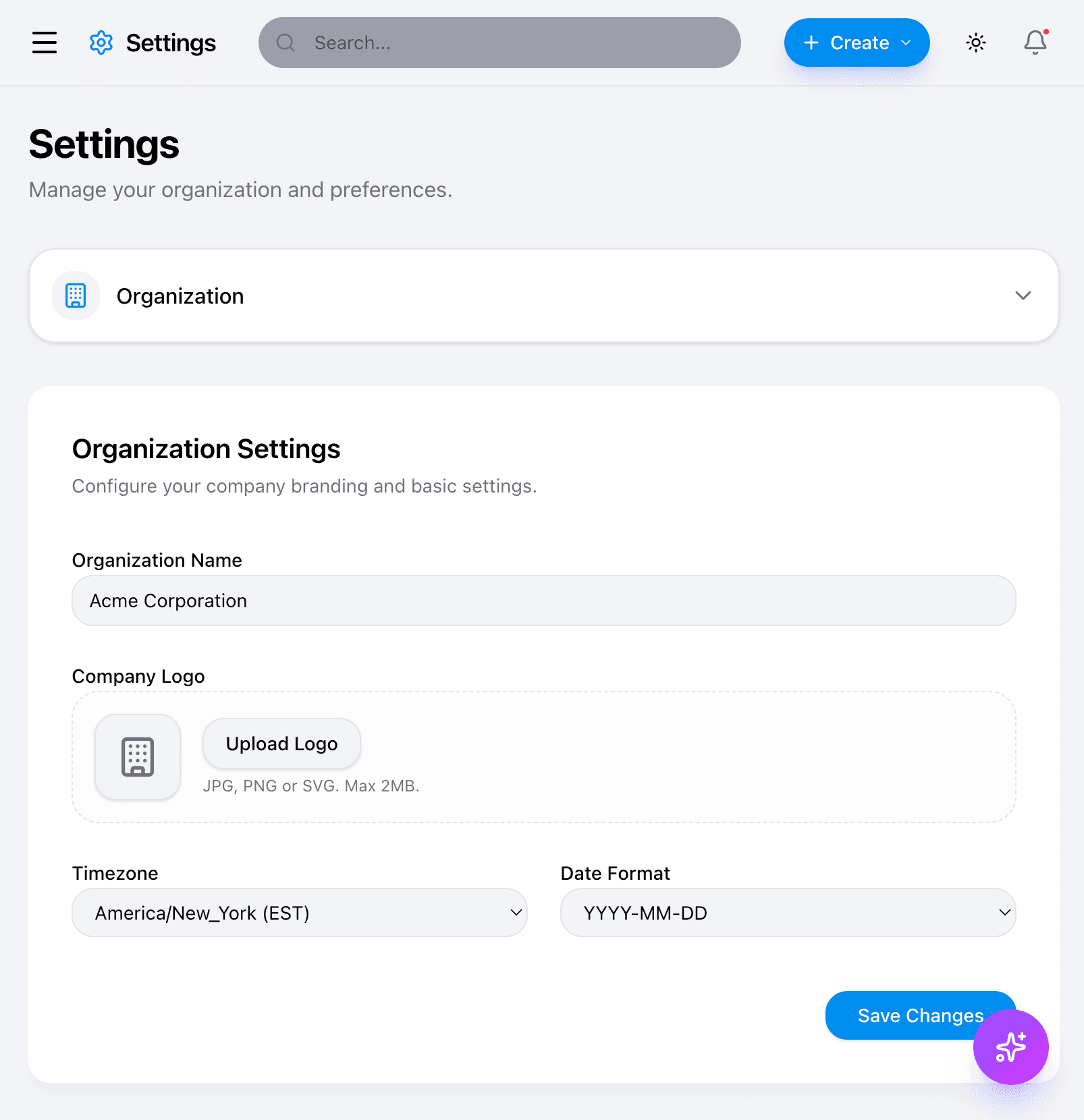
Settings
The settings page allows organization and personal preference management.
Desktop - Organization Settings
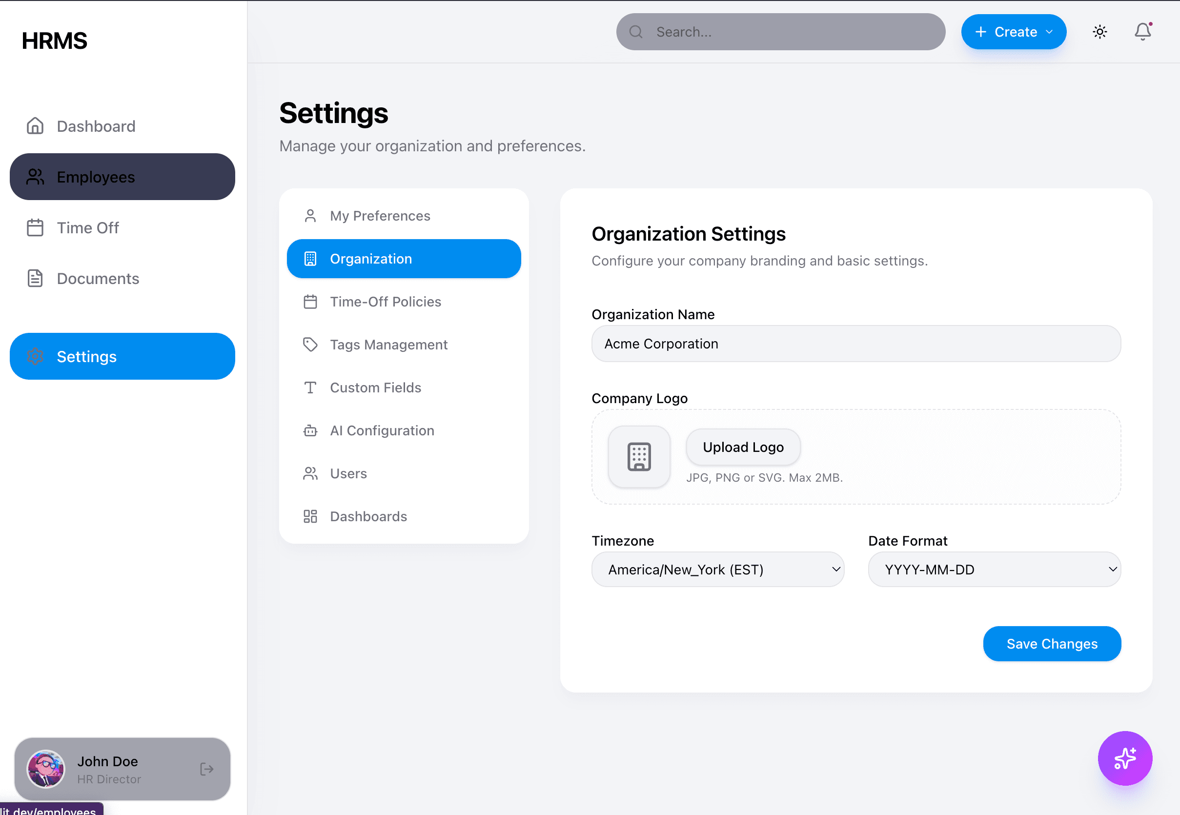
Key Elements:
- Left sidebar navigation: My Preferences, Organization, Time-Off Policies, Tags Management, Custom Fields, AI Configuration, Users, Dashboards
- Active tab highlighted in blue
- Organization Settings form: Name input, Logo upload, Timezone dropdown, Date Format dropdown
- Save Changes button (blue, pill-shaped)
Desktop - My Preferences

Key Elements:
- Appearance toggle: Light, Dark, System (pill buttons)
- Notification checkboxes with descriptions
- Save Preferences button
Mobile - Settings
Settings on mobile uses accordion-style navigation.


Mobile Adaptations:
- Collapsible accordion for section selection
- Stacked form fields
- Full-width inputs and buttons
Tablet View
Implementation: Part of tenant configuration in Phase 01 - Multi-Tenant Auth
Layout & Navigation
Mobile Sidebar
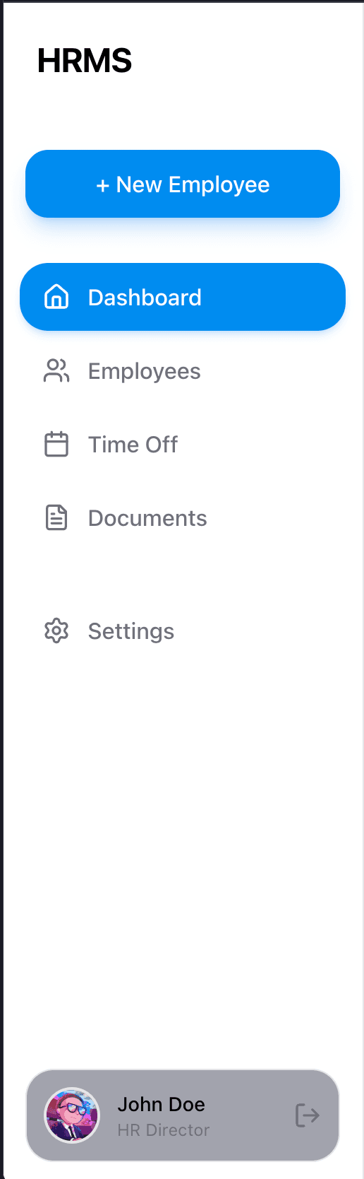
Key Elements:
- HRMS logo/brand
- "+ New Employee" button (blue, pill-shaped)
- Navigation items with icons: Dashboard, Employees, Time Off, Documents, Settings
- Active item highlighted with blue background
- User profile at bottom: avatar, name, role, logout icon
- Light theme with subtle shadows
Implementation: Phase 01.5 - Design System
AI Assistant
The AI assistant is accessible via a floating button and opens as a chat panel.
Floating Button & Popup
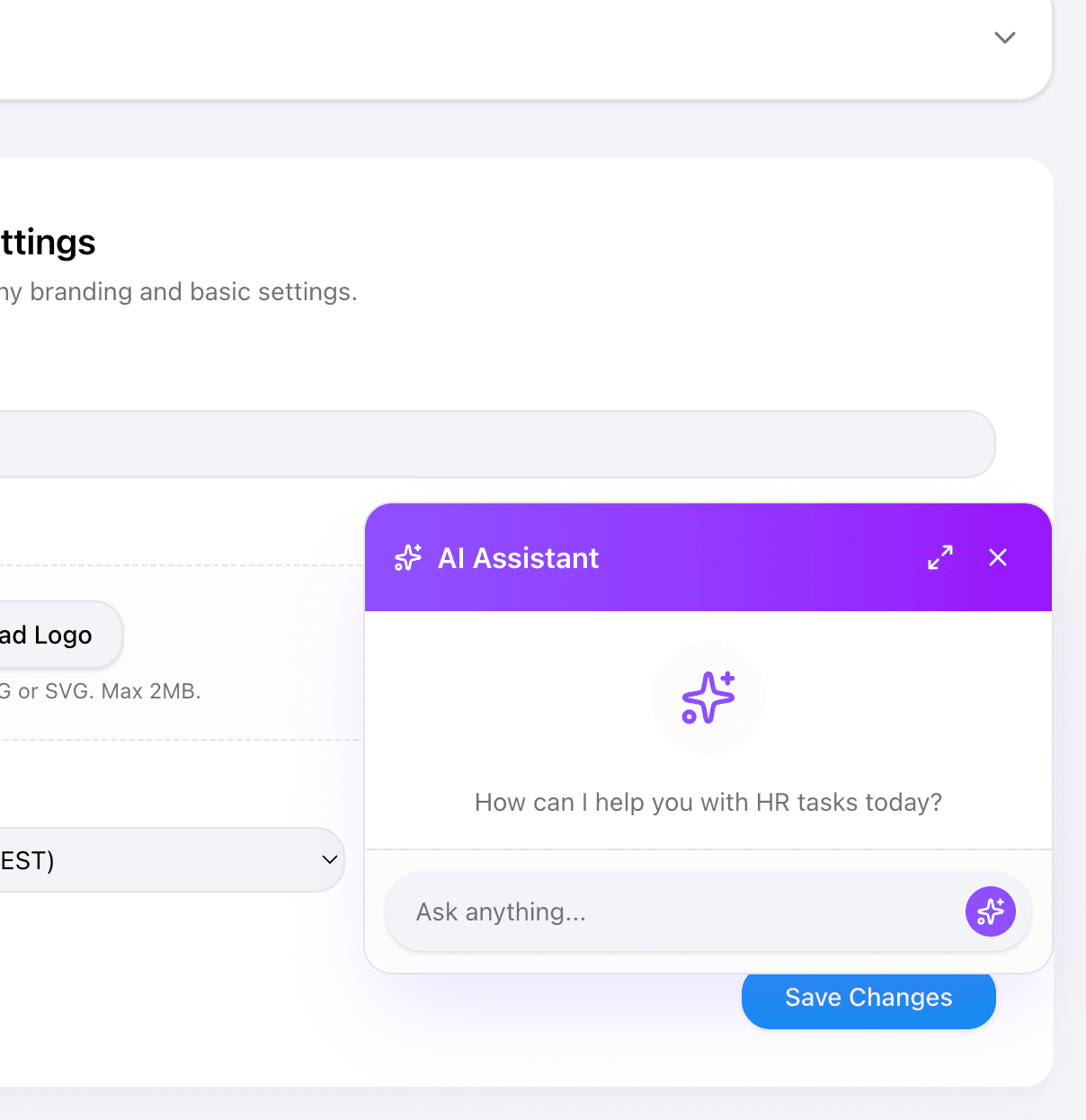
Key Elements:
- Floating button: violet-purple gradient, sparkle icon, positioned bottom-right
- Popup card with violet gradient header
- "AI Assistant" title with sparkle icon
- Expand and close buttons
- Empty state: "How can I help you with HR tasks today?"
- Input field: "Ask anything..." with send button
Fullscreen Panel
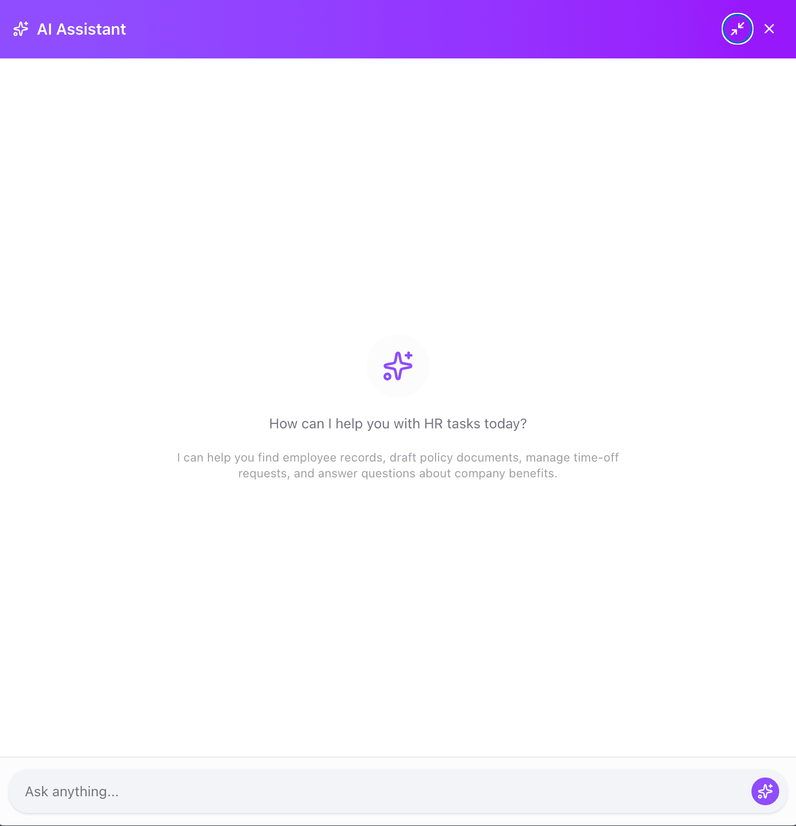
Key Elements:
- Full sidebar panel (mobile: bottom sheet)
- Violet gradient header
- Collapse/expand controls
- Larger chat area
- Capabilities description text
Implementation: Phase 09 - AI Integration
Design Tokens Reference
For detailed color values, spacing, and component specifications, see:
Screenshot Checklist for AI Agents
When building each page, verify against these screenshots:
| Page | Screenshot | Key Verification Points |
|---|---|---|
| Dashboard | dashboard-desktop.png | Gradient stat cards, widget layout, greeting |
| Employees | employees-list-desktop.png | Table format, badges, action icons |
| Profile | employee-profile-desktop.png | Header gradient, tabs, balance cards |
| Time Off | time-off-desktop.png | Balance cards, request list, tabs |
| Documents | documents-desktop.png | Category sections, document cards |
| Settings | settings-desktop-org.png | Tab navigation, form layout |
| AI Assistant | ai-assistant-popup.png | Floating button, popup design |